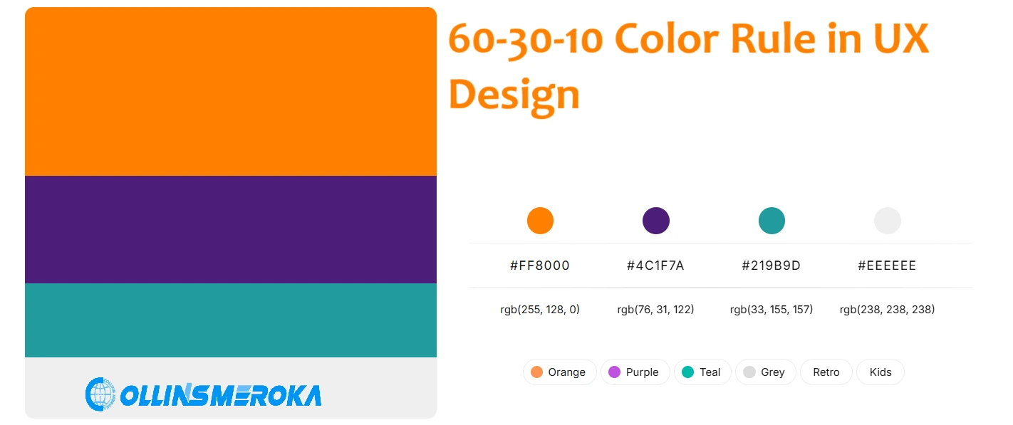
The 60-30-10 color rule is a timeless guideline used by designers to create visually harmonious and engaging interfaces.
Originally rooted in interior design, this principle has found its way into website design, helping developers craft balanced and professional-looking layouts.
It ensures that color is used effectively to direct attention, enhance usability, and create a seamless user experience.
What Is the 60-30-10 Rule in Website UI Design?
The 60-30-10 color rule is a guideline for color use where we divide the colors into three categories:
- 60% - Neutral or Base Color
The base color dominates your design, covering 60% of the interface. This is typically a neutral shade like white, gray, or beige, setting the tone and providing a backdrop for other colors. In a website UI, this could be the background or large blocks of space that create a clean, uncluttered look. - 30% - Primary or Secondary Color
The primary color complements the base, occupying 30% of the design. It adds vibrancy and draws attention to key elements, such as headers, icons, or navigation menus. For example, a website for a travel agency in Kenya might use a bold blue or green to reflect trust and connection with nature. - 10% - Accent or Call-to-Action (CTA) Color
The accent color stands out the most and is used sparingly for CTAs like buttons, links, or notifications. This color should grab attention and encourage action, such as “Book Now” or “Learn More” buttons. For instance, a warm orange or red could be used to emphasize urgency and engagement.
How to Apply the 60-30-10 Rule in Website Design
Applying the 60-30-10 rule to your website design requires a thoughtful approach to selecting and placing colors.
Each percentage represents a distinct purpose, ensuring a balanced and visually engaging interface. Here’s a step-by-step guide to implementing the rule effectively:
1. Establish a Neutral Base (60%)
The neutral base color is the foundation of your design, covering approximately 60% of the interface. This shade provides a calm, unobtrusive backdrop for other elements, ensuring the design feels clean and professional.
- Where to Apply:
Use the base color for large areas, such as backgrounds, sidebars, and card containers. This creates visual breathing room for users and reduces cognitive overload. - Examples of Neutral Colors:
Light shades like white, off-white, or beige are excellent for a minimalist feel, while darker tones like charcoal or navy can add a modern touch for dark-themed websites.
2. Add a Primary Color (30%)
The primary color brings energy to the design and serves as a unifying element across different sections of the website.
This color enhances the visual hierarchy, guiding users to important content without overwhelming them.
- Where to Apply:
Use the primary color for headers, icons, navigation bars, and emphasized text. It should complement the neutral base and tie into your brand identity. - Choosing the Right Primary Color:
Pick a color that resonates with your website’s purpose. For example: - Blue for trust and professionalism (e.g., educational platforms or financial services).
- Green for growth and sustainability (e.g., agriculture or eco-tourism sites).
3. Highlight Actions with an Accent Color (10%)
The accent color is the most attention-grabbing element in the 60-30-10 rule.
It’s used sparingly to emphasize call-to-action (CTA) buttons, clickable links, or alerts. This color drives user interaction and ensures clarity in navigation.
- Where to Apply:
Use the accent color for CTAs like “Buy Now,” “Sign Up,” or “Contact Us.” It should contrast sharply with the base and primary colors to stand out. - Choosing the Right Accent Color:
Select bold shades that encourage action. For example: - Orange for enthusiasm and urgency.
- Red for importance and energy.
Bonus Tips for Applying the Rule
- Test Different Combinations: Use design tools like Figma or Adobe XD to experiment with various color palettes. Test the 60-30-10 allocation to see how it works across different sections of your site.
- Consider Accessibility: Ensure your chosen colors have enough contrast to remain readable for users with visual impairments. Tools like the WebAIM Contrast Checker can help you validate this.
- Maintain Consistency: Apply the rule uniformly across all pages to ensure a cohesive user experience.
When and How to Break the 60-30-10 Color Rule
While the 60-30-10 rule is a tried-and-true guideline, there are instances where breaking it can lead to creative and effective designs.
The key is to understand when and how to adapt the rule without sacrificing balance or usability.
1. Flipping the Rule for Bright Interfaces
In designs where vibrancy and energy are central to the theme, the 60% neutral base can be replaced with a bold, bright color.
This works well for websites that target younger audiences or promote dynamic brands.
- Example:
A music festival website in Kenya might use a vibrant orange or deep yellow as the dominant color to convey excitement. The 30% primary color could be a complementary shade like teal, with a bright purple for CTAs at 10%.
2. Gradient-Based Designs
Gradients allow for a smooth blend of multiple hues, softening the rigid 60-30-10 structure while maintaining visual appeal. This approach works particularly well for modern and tech-focused websites.
- Example:
A fintech platform could use a gradient for the 60% base, transitioning from navy to deep green. The 30% primary color might feature accentuated icons or card designs, with the 10% reserved for action-oriented buttons.
3. Incorporating Images as a Base
For designs where imagery plays a central role, photos or illustrations can replace the neutral base, covering the 60% allocation. This approach works best for industries like travel, real estate, or food services.
- Example:
A travel agency site showcasing Kenyan safaris could use an immersive image of the Maasai Mara as the background. The 30% could highlight navigation menus and section dividers, while CTAs like “Book Your Safari” retain the 10% accent.
4. Evolving the Accent Color
Sometimes, the 10% accent color might not always be a single hue. You can introduce multiple complementary accents, provided they’re used sparingly to maintain focus.
- Example:
A children’s education site might use colorful CTA buttons in green, red, and blue to match the playful tone while ensuring each button’s placement remains deliberate and not distracting.
5. Breaking the Rule with Intent
Breaking the rule isn’t about discarding it entirely but rather bending it to fit the design’s purpose. The balance remains the priority. Ensure that deviations don’t overwhelm users or detract from usability.
- Key Tip:
Always test designs on users to ensure that the adjusted color usage still directs attention effectively and maintains a cohesive visual flow.
Benefits of the 60-30-10 Color Rule
- Ensures visual balance by preventing any single color from dominating the design.
- Enhances usability by guiding users to key areas like CTAs and navigation.
- Conveys professionalism and maturity in website design.
- Supports brand identity by strategically integrating brand colors.
- Simplifies design decisions with a clear and structured framework.
- Scales effectively across devices, ensuring visual appeal on all screen sizes.
The 60-30-10 rule is a powerful tool for creating visually balanced and engaging website designs.
If you want to evaluate your current website or need expert help crafting a design that captivates your audience, contact us today at https://collinsmeroka.co.ke/contact-us.
Let’s bring your vision to life!
About the Author

Collins Meroka is a Digital Marketing Consultant with over a decade of experience applying psychological principles to digital marketing campaigns across Kenya. He holds a degree in Telecommunications... [Read more]
More Tips on Digital Marketing in Kenya
Case Study of SEO Services in Kenya with 300%+ Growth
Startups face a specific SEO problem: "Historical Data Deficit." Search engines trust known entities with established pa...
The Best SEO Companies in Kenya 2026
Ranking in search engines now requires technical maturity and semantic authority, not just basic keyword placement. We...

WordCamp Nairobi 2025
WordCamp Nairobi 2025 is themed "The Digital Safari: Explore, Build, and Share the Power of WordPress." The event will t...