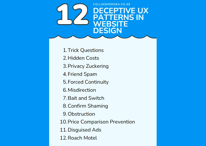
Deceptive UX design patterns are UX design practices that manipulate users into taking actions they didn’t intend.
For example, patters that lead customers to making purchases, sharing personal data, or subscribing to services they don’t need.
Deceptive UX design patters are often called “dark UX patterns.”
These tactics might deliver short-term gains to a brand. The dark UX patterns can damage trust, harm user experiences, and can even lead to public backlash against a brand in the long-term.
1. Trick Questions
Trick questions use deliberately confusing or deceptive wording to manipulate user decisions. This pattern preys on users' assumptions and habits, often leading them to take unintended actions.
Example: Imagine a user trying to cancel their subscription. A confirmation popup appears with the question: "Are you sure you want to cancel your subscription?" The buttons below read:
- Cancel
- No
At first glance, the user might assume "Cancel" means canceling their subscription. However, it often means canceling the action of unsubscribing.
This ambiguity frustrates users, leading to errors and unnecessary retention.
Why Trick Questions is Harmful
- Users feel manipulated and lose trust in the brand.
- Confusion increases friction, resulting in abandoned actions or calls to customer support.
- Negative experiences can lead to complaints or public backlash against your business.
How to Avoid
- Use clear and straightforward language in confirmation prompts.
- Example Fix: Replace the ambiguous popup with: "Do you want to cancel your subscription?" and buttons labeled "Yes, Cancel" and "Keep Subscription."
- Test your copy with real users to ensure clarity.
2. Hidden Costs
Hidden costs refer to fees or charges that are only revealed late in the checkout process, such as during payment.
This deceptive pattern can frustrate users who feel blindsided, leading to abandoned transactions.
Example: A user adds a product to their cart listed at Ksh. 1,000. However, during checkout, additional charges like "service fees" or "handling fees" appear, raising the total to Ksh. 1,255.
Why It is Harmful
- Users lose trust in the brand and may abandon their purchase.
- Negative experiences often result in poor reviews or reduced customer loyalty.
How to Avoid this Dark UX Pattern
- Display all costs upfront, including any fees or taxes, so users can make informed decisions.
- Use a pricing breakdown before checkout to ensure transparency.
3. Privacy Zuckering
Named after a controversial Facebook practice, privacy zuckering tricks users into sharing more personal information than they realize.
Often, this involves pre-checked boxes or vague language in privacy policies.
Example: A form has a pre-checked box that reads: “I agree to share my browsing data with third-party advertisers.” Users, in a rush, may not notice and unintentionally grant permissions.
Why It’s Harmful
- Breaches trust and makes users feel exploited.
- Can result in legal issues, especially with stricter privacy laws like GDPR.
How to Avoid
- Use opt-in rather than opt-out mechanisms.
- Example Fix: Present users with clear, unchecked options for data sharing.
- Be transparent about what data is collected and how it’s used.
4. Friend Spam
Friend spam occurs when users are unknowingly tricked into inviting their contacts to a platform or sharing promotional messages on their behalf.
Example: A platform asks for access to a user’s contacts for “improved recommendations.” However, after gaining access, it sends invitations to all the user’s contacts without explicit permission.
Why It’s Harmful
- Embarrasses users, especially if contacts receive unexpected messages.
- Damages trust in the platform and often leads to public backlash.
How to Avoid
- Clearly state why access to contacts is required and explicitly ask for permission to send invites.
- Example Fix: “Would you like to invite your contacts to join? Choose specific contacts to invite.”
- Avoid default permissions that allow spamming.
5. Forced Continuity
Forced continuity traps users in a subscription or service by making it intentionally difficult to cancel.
The goal is to retain users by creating unnecessary friction during the cancellation process.
Example: A user looking to cancel a subscription clicks on "Cancel Subscription" but is redirected to several pages that reiterate the benefits of staying subscribed.
The final step requires them to email customer support to confirm the cancellation, adding frustration and delay.
Impact of Forced Continuity
- Users feel trapped and manipulated, leading to negative reviews and reputational damage.
- This deceptive UX pattern discourages users from returning to your platform in the future.
Better Practices in UX
- Provide an easy-to-find “Cancel Subscription” button with clear, actionable steps.
- Confirm cancellations with a straightforward message, such as: "Your subscription has been successfully canceled."
6. Misdirection
Misdirection uses deceptive layouts or confusing visual cues to divert users’ attention, often guiding them toward actions they didn’t intend to take.
Example: On a checkout page, the button to add optional insurance is brightly colored and prominent, while the “No, thank you” option is a faint link in small text.
Users are visually steered into opting for the add-on.
Why It’s Problematic
- This pattern takes advantage of user trust and leads to buyer’s remorse when users realize they’ve made unintended decisions.
- Users are less likely to recommend or trust the brand after experiencing misdirection.
What Works Instead
- Use uniform styling for all options so users can make informed choices without bias.
- Test layouts for clarity to ensure users understand their options.
7. Bait and Switch
This deceptive UX pattern promises one thing but delivers another. It lures users in with enticing offers or visuals, only for the actual product or experience to differ significantly.
Example: A user clicks on an advertisement for a $10 monthly service plan, but during checkout, the only options available are $30 or $50 plans.
The Risk of Losing Trust
- Users feel cheated and are unlikely to return to a brand that misrepresents its offerings.
- Public exposure of bait-and-switch tactics can lead to widespread reputational harm.
The Ethical Approach
- Ensure your advertisements and landing pages match your actual offerings.
- Highlight clear disclaimers for any restrictions or variations in the product or service.
8. Confirm Shaming
Confirm shaming relies on guilt or shame to push users into taking an action they might otherwise avoid. This tactic is often used on subscription or newsletter opt-out pages.
Example: A popup asks users to subscribe to a newsletter. If they decline, the button reads: "No, I don’t want to save money." This makes users feel judged for opting out.
Why It Damages User Experience
- It creates a negative emotional association with your brand, making users less likely to engage further.
- Users may avoid recommending your site, feeling their preferences aren’t respected.
A Respectful Alternative
- Use neutral and respectful language, such as: “No, thank you. I’ll subscribe later.”
- Allow users to decline offers without creating unnecessary friction or guilt.
9. Obstruction
Obstruction makes completing tasks unnecessarily difficult, forcing users through tedious processes that discourage action or trap them in unwanted services.
Example: A user tries to delete their account, but the process involves navigating multiple pages, contacting customer support, and providing unnecessary information.
Each step is designed to make quitting seem too cumbersome to bother.
Consequences of Obstruction
- Frustrated users are unlikely to return or recommend the platform.
- The brand risks being labeled as manipulative, leading to negative public perception.
How to Improve
- Streamline critical actions like account deletion or subscription cancellation with minimal steps.
- Offer self-service options that empower users to manage their accounts easily.
10. Price Comparison Prevention
This deceptive UX pattern hides competitors’ pricing or makes it difficult for users to compare your product with alternatives.
Price comparison prevention is often done by obscuring details or restricting access to key features until after a purchase.
Example: A product page shows only a general price range, requiring users to sign up or make a purchase to see the exact cost.
Why Transparency Matters
- Lack of transparency frustrates users and undermines trust.
- Users may leave your site to find clearer information elsewhere, reducing conversions.
Best Practice
- Be upfront about pricing and highlight your unique value proposition.
- If competitors’ pricing is a concern, focus on emphasizing the benefits of your product rather than obscuring comparisons.
11. Disguised Ads
Disguised ads look like organic content, tricking users into clicking.
This pattern blends advertisements seamlessly into website design, making them hard to distinguish from genuine content.
Example: A news site places sponsored articles that mimic the style and tone of editorial content. Users click, expecting a genuine article, only to realize they’ve been directed to an ad.
The Harm in Disguise
- Users feel deceived and may distrust all content on the site, even legitimate pieces.
- Click-through rates drop when users learn to associate the site with misleading practices.
A Better Approach
- Clearly label sponsored or promotional content with tags like “Advertisement” or “Sponsored Post.”
- Use distinct design elements to separate ads from organic content.
12. Roach Motel
The “roach motel” pattern makes it easy for users to sign up but nearly impossible to leave. It’s a common tactic in subscription-based services.
Example: A streaming platform allows users to subscribe with a single click but hides the cancellation option deep within settings, often requiring multiple confirmations or customer support intervention.
Why Users Dislike It
- Users feel trapped, leading to frustration and negative feedback.
- Retention through obstruction damages brand reputation in the long term.
The Right Way to Retain Users
- Offer straightforward onboarding and offboarding experiences.
- Focus on delivering value to encourage users to stay, rather than relying on coercion.
If your website’s UX needs a refresh to improve trust and conversions, let us help you create user-friendly and ethical designs.
Get a quote today through and start building better experiences for your users.
About the Author

Collins Meroka is a Digital Marketing Consultant with over a decade of experience applying psychological principles to digital marketing campaigns across Kenya. He holds a degree in Telecommunications... [Read more]


