Websites are often packed with unnecessary elements that confuse users and reduce their effectiveness.
I was going through service websites in Kenya today and I was shocked why most of them get little to no conversions. Many Kenyan websites, for example, are filled with vague headlines, cluttered designs, or outdated features that frustrate visitors and drive them away.
By identifying and removing these barriers, you can transform your website into a tool that delivers a seamless, engaging user experience while boosting your results.
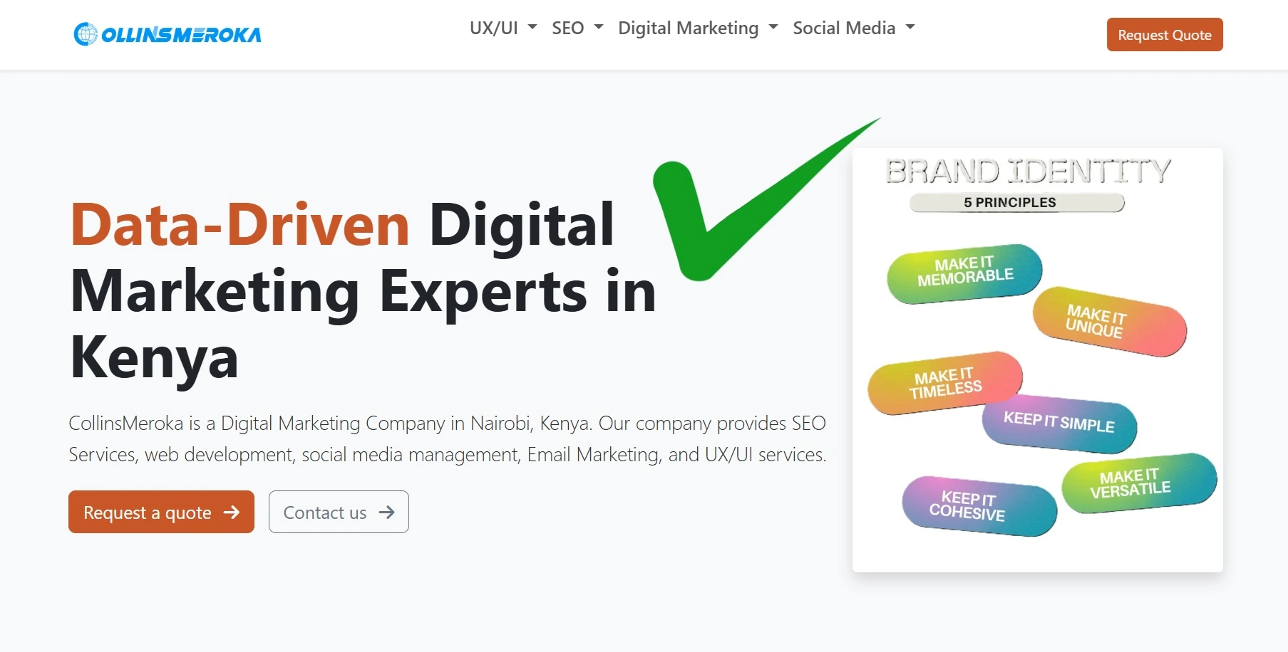
1. Vague Homepage Headlines on Websites
The first impression your website gives is everything, yet many websites fail to deliver a clear message right on the homepage.
Think about it—how many times have you landed on a site only to be greeted by phrases like "Innovating for Tomorrow" or "Your Trusted Partner"? These sound appealing but leave visitors wondering: "What does this company actually do?"
Most Kenyan websites I’ve encountered could benefit from headlines that are straightforward, descriptive, and search-friendly.
Instead of trying to sound clever, aim to answer the visitor's first question: "Am I in the right place?" For example, a headline like "Affordable Roofing Solutions for Residential Homes" is far better than "Building Dreams Together."
A simple way to test your headline is through a quick 5-second test: show someone your homepage for five seconds and ask them what your website does. If they can't answer clearly, it’s time to rewrite.
Swap out vague, abstract language for a headline that immediately tells visitors who you are, what you do, and why they should care. A clear, specific headline not only improves user experience but also gives you a boost in search engine rankings.
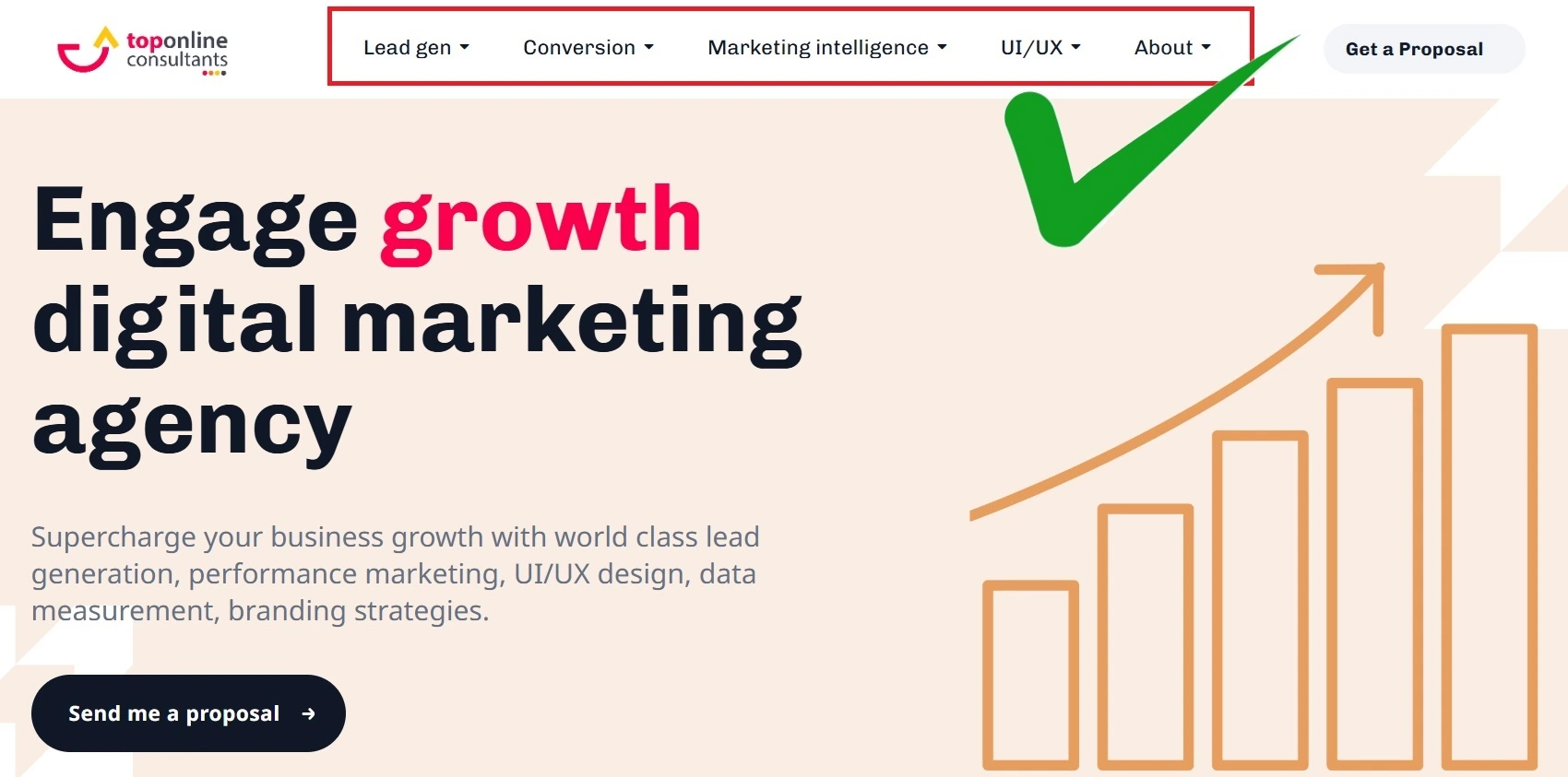
2. Generic Navigation Labels
Navigation is your website's compass, guiding users to the information they need. Yet, many websites in Kenya fall short by using labels like "Products," "Services," or "Learn More," which tell visitors nothing about what lies beneath.
These generic labels make navigation a guessing game, forcing users to click blindly or leave altogether.
Consider how much clearer your navigation becomes with specific, descriptive labels.
For instance, instead of "Products," a company selling office supplies could use "Office Furniture & Supplies" or "Wholesale Stationery." These labels allow users to self-identify and navigate directly to the content they want.
A great way to refine your navigation is by analyzing user behavior in tools like Google Analytics. Track where users are clicking and identify paths where they drop off.
Specific, meaningful labels reduce friction and help visitors find what they need quickly, boosting engagement and conversions.
3. Unhelpful Subheadings
As users scroll through your site, subheadings act as signposts, helping them scan and locate relevant information. Unfortunately, many websites settle for vague subheadings like "Our Services" or "Solutions," which provide no real value.
These generic terms not only waste valuable screen space but also miss opportunities to engage users and improve SEO.
For instance, instead of “Our Solutions,” a software company could write “Custom Software Development for SMEs” or “Cloud-Based Accounting Tools.”
These descriptive subheadings grab attention and signal to search engines what your page is about.
Think about it—when was the last time you searched for "solutions" on Google? Visitors and search engines alike need clarity, so make your subheadings meaningful, specific, and keyword-rich.
This approach not only improves user experience but also ensures your content ranks higher in search results.
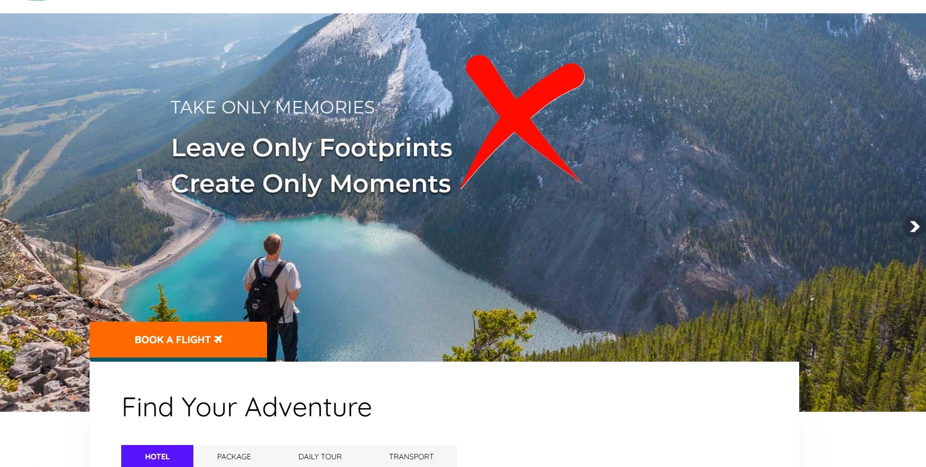
4. Homepage Slideshows (Carousels)
Slideshows may seem like a good way to showcase multiple messages on your homepage, but they rarely work as intended.
Most users only glance at the first slide, while the rest go unnoticed. I’ve seen Kenyan websites proudly display five to ten slides, burying critical information on the eighth or ninth slide, where it’s unlikely anyone will ever see it.
Instead of a rotating slideshow, opt for a single, impactful hero image or message that communicates your main value proposition.
If you must include multiple messages, use a static layout that allows users to scan all the content at once.
For example, an e-commerce site could display three key categories—like “Electronics,” “Fashion,” and “Home Essentials”—side by side on the homepage, ensuring nothing gets lost in rotation.
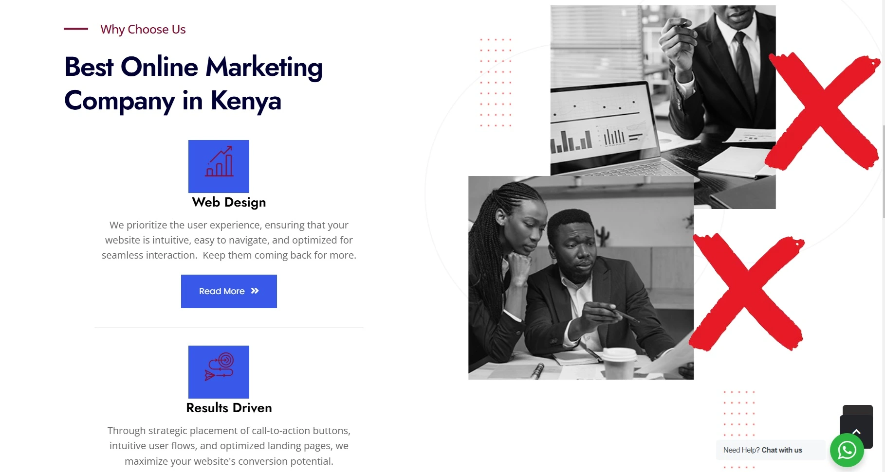
5. Stock Photos of People
Stock photos are everywhere, but they do more harm than good when it comes to building trust and authenticity.
Generic images of smiling models in perfect lighting might look polished, but visitors can instantly tell they’re fake. Most websites would do better with real photos of their teams, products, or even satisfied customers.
For example, imagine a financial consultancy firm using a stock image of a generic handshake on their homepage. Now picture the same firm showcasing a team photo of their advisors at work—real people with real connections.
Authentic visuals like these foster trust, helping users feel more comfortable engaging with your business.
Don’t worry about perfection. A slightly imperfect but genuine photo will resonate far more with your audience than a staged image that lacks soul.
This shift can significantly improve how users perceive your brand, keeping them engaged and more likely to trust your services.
6. Social Media Icons in the Header
Many websites place bright, colorful social media icons prominently in the header, often as a key feature. While this might seem like a smart move to connect with your audience, these icons often act as exit doors, tempting visitors to leave your site.
Once on a social platform, they’re bombarded with distractions—notifications, viral posts, or endless scrolling—rarely returning to your website.
A smarter approach is to relocate these icons to the footer. Visitors who truly want to follow you on social media will still find the links, but they won’t be tempted to abandon your site prematurely.
For example, a Kenyan retail website could reserve the header for navigation to products, while placing subtle, monochrome social media icons in the footer for a less intrusive presence.
This small adjustment helps you retain traffic, ensuring users stay focused on your content and calls to action.
7. Dates on Evergreen Blog Posts
Dates on blog posts can be useful for news articles or time-sensitive content, but they often work against you when it comes to evergreen content—those timeless articles designed to remain relevant for years.
Many Kenyan websites inadvertently discourage readers by showcasing a post date from years ago, even if the information is still valuable today.
Imagine a blog post titled “10 Tips to Save on Construction Costs.” If a visitor sees that it was written in 2016, they may assume the advice is outdated and move on, even if it’s still applicable.
A better solution is to remove automatic date stamps from evergreen posts. Alternatively, if the content has been updated, you could display a note like “Last Updated: January 2024” to signal its relevance.
By hiding or carefully managing dates, you ensure your content appears fresh and engaging, regardless of when it was written.
8. Long Paragraphs
Reading online isn’t like reading a book. Visitors scan content quickly, looking for key points, yet many websites present information in long, dense paragraphs that feel overwhelming.
I’ve often seen Kenyan business websites bury critical details in bulky blocks of text, assuming visitors will patiently sift through everything.
The fix? Break up content into shorter, two- to three-line paragraphs. Read that again, it is 2-3 lines, not sentences.
Use formatting tools like bullet points, numbered lists, or bold text to highlight key information. For instance, a real estate website explaining the benefits of buying versus renting could use a clear list format rather than lengthy paragraphs.
This scannable approach helps users quickly absorb the main points, keeping them engaged and on your site longer.
9. Press Releases as Website Content
Press releases serve a purpose, but they are rarely engaging for web visitors. Many Kenyan companies treat their websites as a dumping ground for unedited press releases, full of jargon like "For Immediate Release" and overly formal language that fails to resonate with readers.
Instead of simply uploading press releases, reframe the content into an engaging story or blog post.
For example, if a company is announcing a new partnership, they could write a post highlighting how the partnership benefits their customers, including quotes, images, and actionable insights.
This approach transforms dry press release content into something visually appealing and reader-friendly.
By focusing on storytelling rather than corporate announcements, you make your website content more appealing and relevant to your audience.
10. Excessive PDFs
PDFs might seem convenient for sharing information, but they are ill-suited for websites. Many Kenyan websites, particularly in sectors like education and government, rely heavily on PDFs for downloadable brochures, forms, or reports.
However, PDFs present numerous challenges—they aren’t interactive, are difficult to update, and lack SEO optimization.
For example, a school website hosting its course catalog as a PDF misses the opportunity to make that information searchable and accessible on the site itself.
Instead, convert PDF content into web-friendly formats, such as dedicated pages with easy navigation.
While you can still offer PDFs for download, the primary information should live on your site, enhancing user experience and visibility in search engines.
11. Testimonials Pages
Testimonials are a powerful trust-building tool, but isolating them on a single page reduces their impact.
Many Kenyan websites create a “Testimonials” tab in the navigation, expecting visitors to seek out social proof on their own. In reality, these pages often go unnoticed, wasting valuable credibility.
A better approach is to weave testimonials into relevant pages across your site. For instance, an e-commerce site could include customer reviews directly on product pages, or a service provider could showcase client feedback on their “About” or “Services” pages.
Imagine a web design agency in Kenya adding a testimonial from a satisfied client below their portfolio showcase—it feels natural and reinforces trust where it matters most.
By integrating testimonials site-wide, you create a seamless experience where users encounter social proof as they explore your offerings.
12. Email Links Instead of Contact Forms
Email links, though common, are outdated and riddled with issues. Clicking an email link depends on the user having a default mail client configured—something many visitors don’t.
Additionally, these links are spam magnets, as bots scrape email addresses from websites.
Contact forms are a far superior alternative. They allow you to track submissions, route inquiries to the right department, and even automate responses.
For example, your travel agency could use a form to capture specific details like travel dates and preferred destinations, making follow-ups easier and more effective.
Forms also let you guide users to a thank-you page, where you can offer additional resources or a special discount.
Switching from email links to contact forms ensures a smoother experience for users and greater efficiency for your business.
13. Dead-End Thank You Pages
When users complete an action—such as submitting a form or signing up for a newsletter—the thank-you page is often a forgotten opportunity.
Many websites simply display a generic “Thank you” message with no further direction, effectively ending the visitor’s journey.
A more strategic approach is to make your thank-you pages engaging. For example, your event planning company could use the thank-you page to recommend related services, link to their blog, or encourage visitors to follow them on social media.
You could also include a secondary call to action, like “Subscribe to our updates” or “Download our free event checklist.”
Keeping users engaged even after conversions, you create more opportunities for interaction, increasing the likelihood of repeat visits and long-term connections.
Your website is more than just a digital presence—it’s a powerful tool that should guide, engage, and convert visitors. By removing these 13 common obstacles, you can create a cleaner, more intuitive experience that keeps users coming back and helps your business achieve its goals.
But sometimes, knowing where to start can be overwhelming. That’s where I come in! If you’d like an expert set of eyes on your website, I’d be happy to help. As a UX/UI designer, I can provide a short, actionable report highlighting areas for improvement that could boost your conversions—or we can schedule a free 30-minute video call to review your site together.
Let’s make your website work harder for you. Reach out today, and let’s take the first step toward building a user-friendly, high-performing website that truly delivers results.
About the Author

Collins Meroka is a Digital Marketing Consultant with over a decade of experience applying psychological principles to digital marketing campaigns across Kenya. He holds a degree in Telecommunications... [Read more]
More Tips on Digital Marketing in Kenya
Case Study of SEO Services in Kenya with 300%+ Growth
Startups face a specific SEO problem: "Historical Data Deficit." Search engines trust known entities with established pa...
The Best SEO Companies in Kenya 2026
Ranking in search engines now requires technical maturity and semantic authority, not just basic keyword placement. We...

WordCamp Nairobi 2025
WordCamp Nairobi 2025 is themed "The Digital Safari: Explore, Build, and Share the Power of WordPress." The event will t...