You’ve built a website, attracted traffic, and waited for sales or inquiries to roll in—but nothing happens.
This is the frustrating reality for many websites in Kenya, where tons of visitors leave without taking any action. Why? Poor design choices and a lack of clear messaging.
In fact, studies show that 88% of users leave a website due to poor user experience, and the top culprit is not understanding what the business offers within seconds.
Here’s the good news: your website can become a conversion machine. By following these simple steps rooted in design psychology, you can organize your landing page in a way that leads visitors to take action.
I will show you the formula for creating a high-converting landing page or website in Kenya.
1. Start with an Effective Hero Section
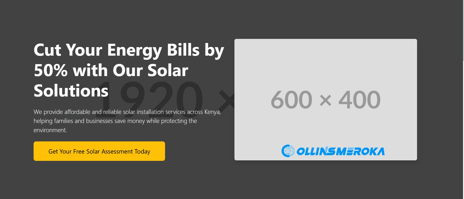
The hero section is the first thing visitors see, and it’s your chance to make a great first impression.
If your hero section doesn’t immediately communicate what your business does and why it matters, users will bounce within seconds.
This section must be clear, compelling, and actionable.
4 Things to Include in the Hero Section
- A strong headline: Focus on the result your product or service delivers. People don’t buy products; they buy outcomes.
- Example: Instead of “We Sell Solar Panels,” try “Cut Your Energy Bills by 50% with Our Solar Solutions.”
- A subheadline: Support the headline by briefly explaining how you deliver the promised result.
- Example: “We provide affordable and reliable solar installation services across Kenya.”
- A clear Call-to-Action (CTA): Your CTA should guide users on what to do next and use action-oriented language.
- Replace generic CTAs like “Learn More” with “Get Your Free Solar Assessment Today.”
- A visual that connects emotionally: Use an image that reflects the “happy after” state of your customer. For instance, show a smiling family enjoying a solar-powered home rather than a generic product photo.
Why It Matters
Studies show that visitors form an opinion about your website in just 50 milliseconds.A well-designed hero section ensures they stay long enough to explore further.
2. Use the Problem-Solution Framework
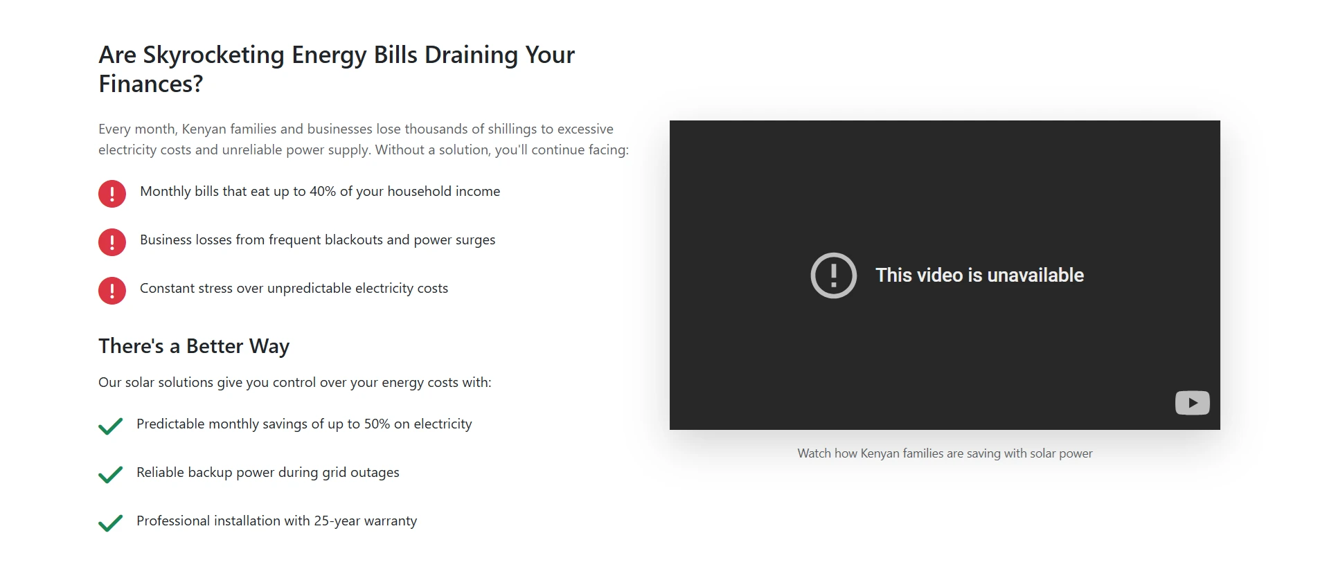
After grabbing attention with your hero section, the next step is to connect with your audience by addressing their pain points.
People visit your site because they’re searching for solutions—show them you understand their struggles and have the perfect answer.
How to Structure This Section:
- Identify the problem: Speak directly to your audience’s pain points.
- Example: “Struggling with unreliable delivery services that hurt your business reputation?”
- Agitate the problem: Highlight the consequences of leaving the issue unresolved.
- Example: “Late deliveries lead to unhappy customers and lost revenue.”
- Present your solution: Show how your product or service solves their problem.
- Example: “Our logistics platform ensures timely and cost-effective deliveries across Kenya, keeping your customers happy and your business thriving.”
Pro Tip:
Pair this section with a short, engaging video.
Adding a video to your landing page can increase conversions by up to 86%, and it also keeps visitors on your page longer—a positive signal for Google rankings.
3. Highlight the Benefits

This section is where you show potential customers why they should choose you over competitors. The key is to focus on benefits—not just features.
Benefits address the “what’s in it for me?” question in a way that resonates emotionally.
How to do it Right
- Focus on outcomes: Use headlines that highlight benefits rather than technical specs.
- Example: Instead of “Advanced Tracking Software,” say “Never Lose Track of Your Deliveries Again.”
- Support benefits with features: For each benefit, explain the feature that makes it possible.
- Example: “Benefit: On-time deliveries. Feature: Real-time GPS tracking for all orders.”
- Visualize the benefits: Use icons, images, or short animations to illustrate key points.
Why It Works
Benefits speak to the emotional reasons people buy, while features back up their decisions logically. Combining both creates a compelling narrative that drives action.
4. Build Trust with Testimonials

People trust the experiences of others. Including testimonials on your landing page provides social proof and reassures visitors that your product or service delivers as promised.
If done right, this section can significantly boost conversions.
How to Create an Effective Testimonial Section
- Select impactful testimonials: Use quotes that address specific benefits or objections. Avoid generic statements like “Great service!” Instead, include testimonials that highlight how your business solved a problem.
- Example: “I’ve seen a 40% increase in sales since switching to their logistics services. Deliveries are always on time, and my customers are thrilled!”
- Add visual elements: Include a photo of the customer (with permission), a star rating, or the logo of the company they represent. These visuals make testimonials more relatable and credible.
- Keep it concise: Short, powerful statements work best. Visitors won’t read long paragraphs.
- Leverage review platforms: Add badges or logos from review platforms like Google or Facebook to show broader social proof. For example, “Rated 4.9/5 on Google Reviews.”
Why it works
About 72% of consumers take action only after reading positive reviews.
Testimonials not only provide evidence but also address potential doubts, making it easier for users to trust your brand.
5. Include a Features Section

While benefits appeal to emotions, features provide the logical validation customers need to justify their decision.
This section should clearly outline what your product or service includes.
How to Format the Features Section
- Use a list or grid layout: Organize features in a simple, scannable format like bullet points or icons.
- Example: “24/7 Customer Support,” “Real-Time Order Tracking,” “Unlimited Revisions.”
- Be specific: Highlight details that set you apart.
- Example: “Track deliveries across all Kenyan counties with our GPS-enabled platform.”
- Pair features with benefits: Whenever possible, connect features to the benefits they deliver.
- Example: “Feature: Automated notifications for delivery updates. Benefit: Keep your customers informed and happy.”
Why it Matters
This section appeals to analytical users who want to know exactly what they’re getting.
Combined with the benefits section, it creates a well-rounded argument for why your service is the best choice.
6. Answer FAQs
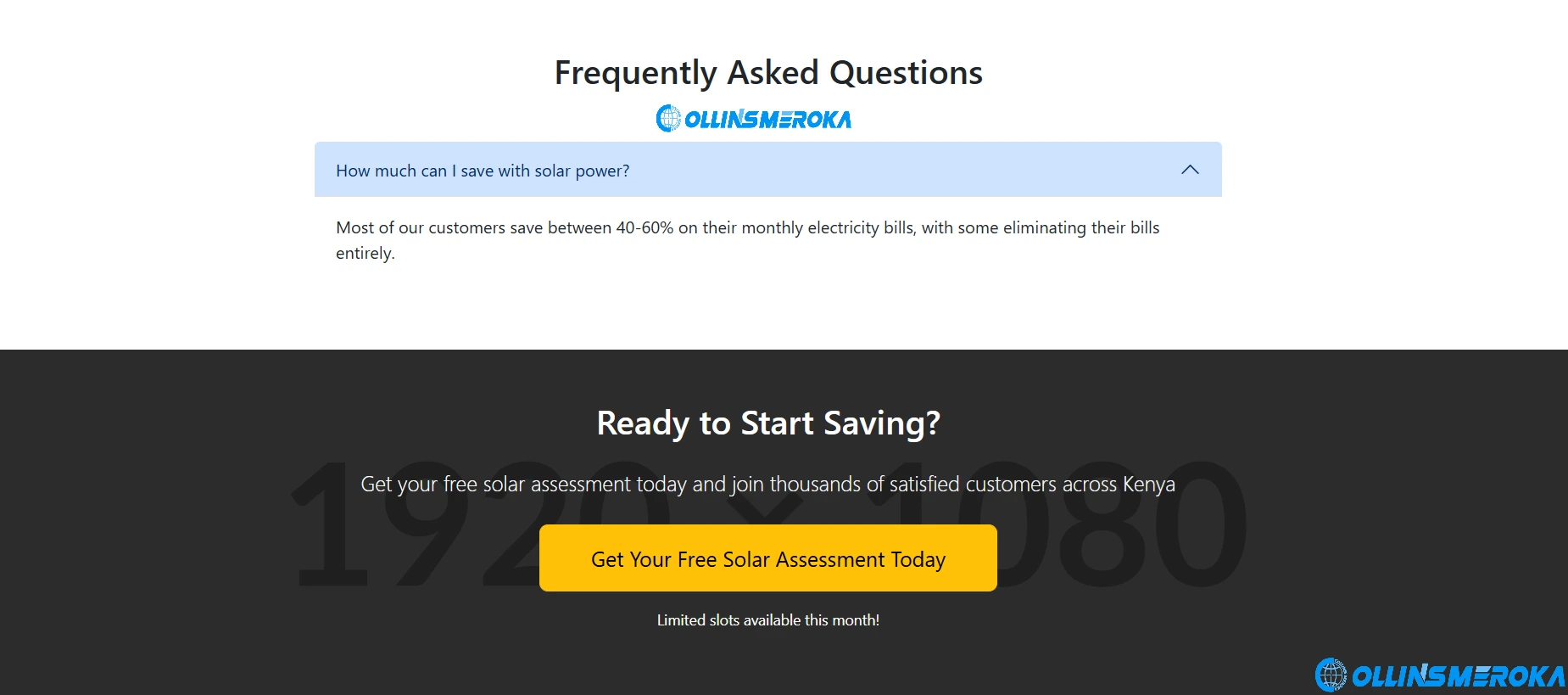
Anticipate and address common questions or objections that potential customers might have. A good FAQ section can reduce friction and encourage users to move forward with confidence.
What to Include in FAQs
- Top customer questions: Focus on practical queries, such as pricing, timelines, or service coverage.
- Example: “Do you deliver to rural areas in Kenya?”
- Address objections: Overcome common concerns by providing reassuring answers.
- Example: “What if my package gets delayed?” Answer: “We offer a money-back guarantee for late deliveries caused by our system.”
- Be concise: Write clear, straightforward answers. Long-winded explanations can overwhelm visitors.
Pro Tip:
Add video responses to FAQs for a personal touch. Videos build trust and help retain visitors longer, improving both conversions and search engine rankings.
7. End with a Strong Call-to-Action

Your landing page should close with a clear, compelling CTA that encourages visitors to take the next step.
Reiterate the action you want them to take and why it benefits them. I encourage using the same CTA at the hero section to emphasize it through repetition.
How to create an effective CTA section:
- Action-oriented language: Use direct phrases like “Book Your Free Consultation” or “Get Started Today.”
- Highlight the value: Emphasize what they’ll gain by clicking.
- Example: “Schedule a Call Now and Start Growing Your Business Tomorrow.”
- Consistency: Again, ensure your CTA matches the one in your hero section for clarity.
Pro Tip:
Create a sense of urgency by adding phrases like “Limited Slots Available” or “Offer Ends Soon.”
You can checkout this template that I made using Bootstrap 5.3 for your inspiration: >>> Free Template for High Conversion Rate Website in Kenya <<<
A high-converting landing page is more than just a design—it’s a tool that drives action and grows your business.
If you’re ready to optimize your website for better results, contact us today at https://collinsmeroka.co.ke/contact-us.
Let us help you turn visitors into loyal customers!
About the Author

Collins Meroka is a Digital Marketing Consultant with over a decade of experience applying psychological principles to digital marketing campaigns across Kenya. He holds a degree in Telecommunications... [Read more]
